Check Out My Etsy Shop...

Wednesday, 20 June 2012

DIY Revamped Phone Case.

So. I received my mod podge in the post the other day and as usual, I was gagging to use it. I noticed my phone case was looking overly shabby chic so this was the perfect opportunity to use my mod podge and make a tutorial. I hope you all feel inspired to revamped your phone case :) Step 1 is to flatter your phone case with flatting paper to give the paint a surface to stick to, and in my case, to remove the image that was already originally printed on the plastic case. Make sure the grain of the flatting paper isn't TOO coarse as it almost engraves into the plastic, which looks nasty when you come to paint on top.

Step 2: Give it a lick of paint. I chose a matt black just to make sure I covered up all the underlying paint. But of course you can use any colour you want.


Step 3: Plan your design, I decided to plan in my sketchbook to get some idea of what type of daisy i wanted. I then draw patches of daisy's with a 0.5 waterproof fine liner and coloured in several of the petals in bright colours.


Step 5: I then used a uni paint marker in white to make small lines, almost like petals around the screen window. This just adds that bit of detail. 


Step 6: The next step is to cut out your patterns. I left a slight border around the flowers.


step 7: Then using a flat end brush or a sponge roller, apply a generous coat of mod podge or pva glue to the  entire phone cover (not on the inside or your phone might become permanently stuck!) and making sure it an even layer. when dry, apply a layer of pva/podge on the back of your paper or fabric design.


Then Your DONE! once its all dry, i recommend leaving it over night and if you want you could add a coat of clear acrylic sealer (spay or brush on) just to add that extra shine :)
Drumroll please..........


Taa-dahhh...


<3

Wednesday, 6 June 2012

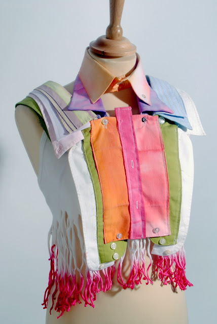
Up-cycle Hippy Fashion Shirt Project.

Ok, so for my fashion project I have just finished, the brief was to create a garment using only old shirts. I had to choose a theme. This theme would become the entire inspiration for the final outcome of the garment. (I chose hippy ;)) Then by creating a range of illustrations and observational drawings, studying how the shirt is pieced together. Here is my final outcome anyway, let me know what you think :)
Portfolio Illustration. 

________________________________________________________


<3


Textile journey project part two finished!


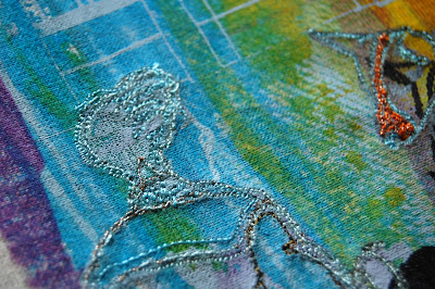
These are the several wall hangings i made using a variety of techniques. Screen printing, embroidery, foiling, fabric painting, appliqué, and stencilling. 
When i was planing my final outcome, I knew exactly what I wanted to achieve. and looking back into my textiles sketchbook, i think i have done my plans justice!
I will try and get some scans of my sketchbook pages that back up my thoughts ect.


Oh yeah, My journey was London, Brick lane market.
I wanted to focus on the buildings and future architecture that's taking place. Then , using colour, i was trying to represent how busy, vibrant , unique and multi cultural the capital is.